A time ago I never existed

This logo was redesigned for free without interest in financial compensation.
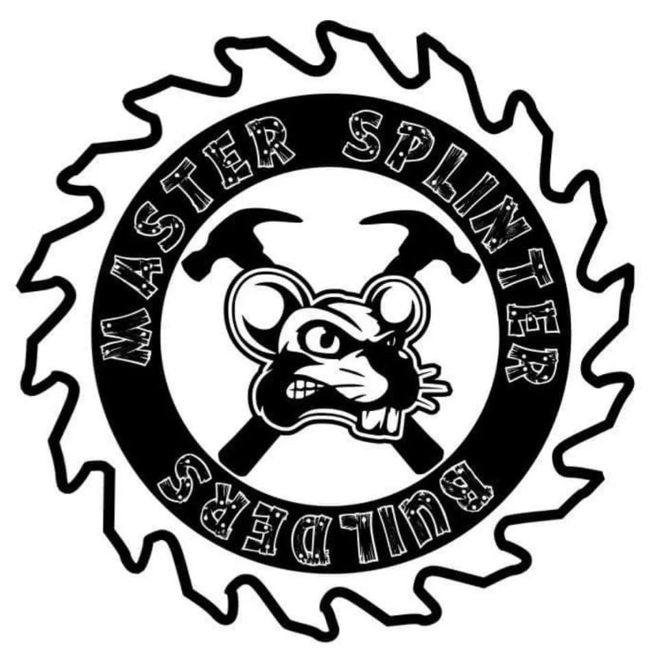
The bottom most photo was this businesses original logo design, and I offered a free logo re-design.
(Photo 1, pair of 3 Logos) These additional logo redesigns were requested as the business is attempting to steer away from the Rat Head being in their logo. Therefore the rat head was replaced with Wood planks, and complimented with a pair of Nails.
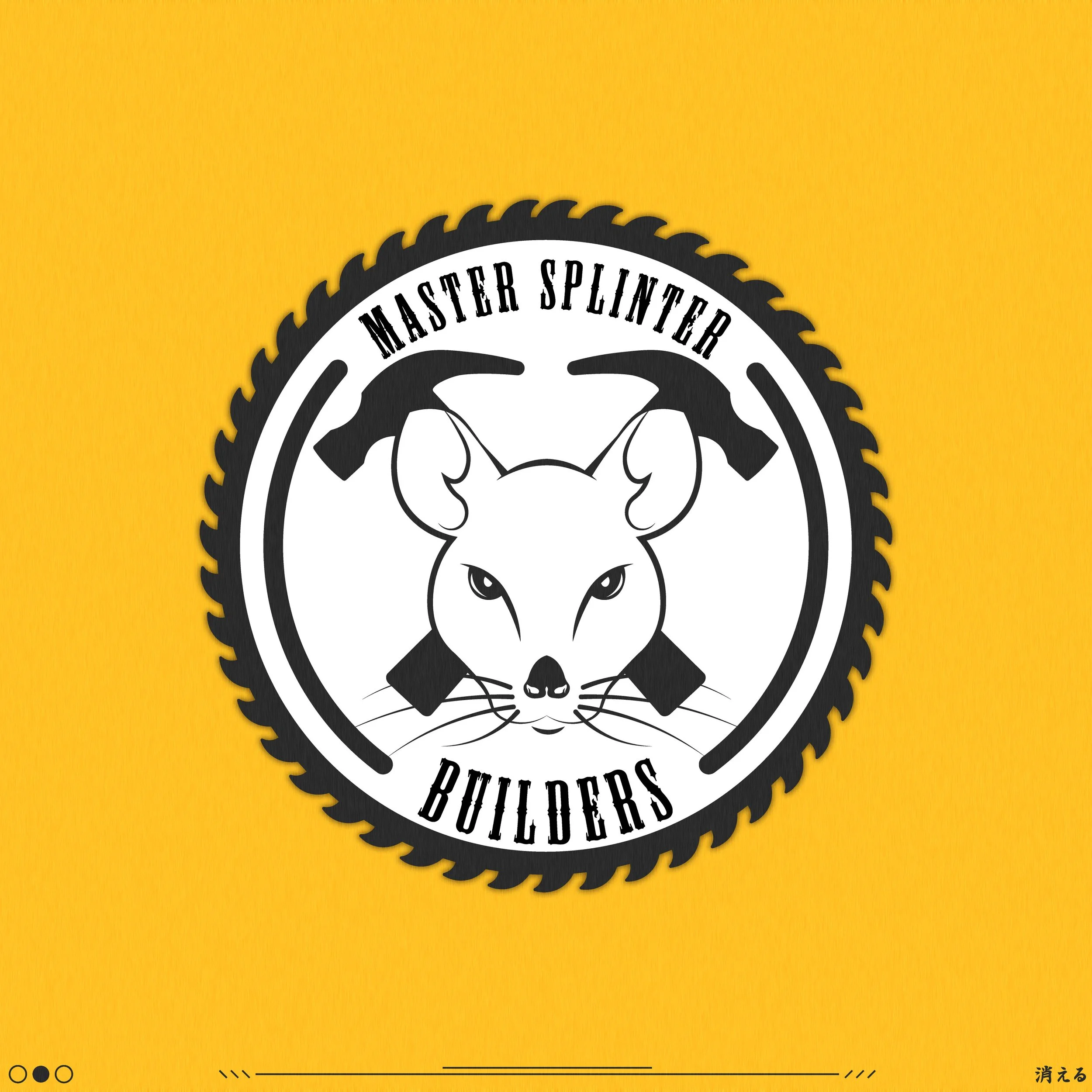
(Photo 2, yellow background) The original redesign was to clean up the “Clip-Art” feel of the original logo. I went about this by simplifying the Buzz Saw design to something more intact, with slightly smoothed blade tips so that the look of the design is more appealing to the eye. The Rat head was completely redesigned to a frontal view of a rat, with a relative aggressive feel to the face. The hammers were slightly redesigned and kept the same position and rotation. Curved lines were placed on the left and right side of the inside of the Buzz saw to connect the top and bottom text.