A time ago I never existed
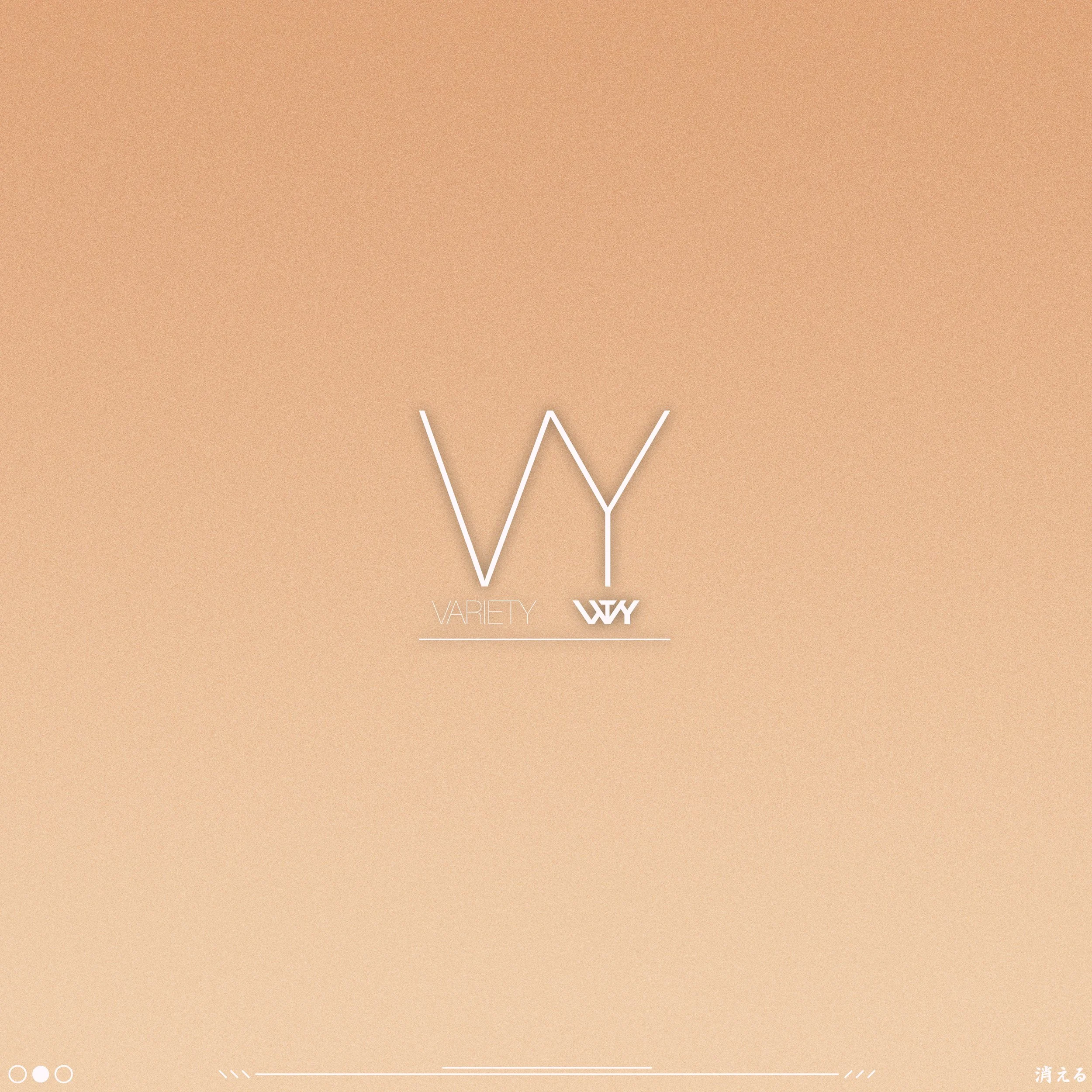
These designs were made for a mock company.
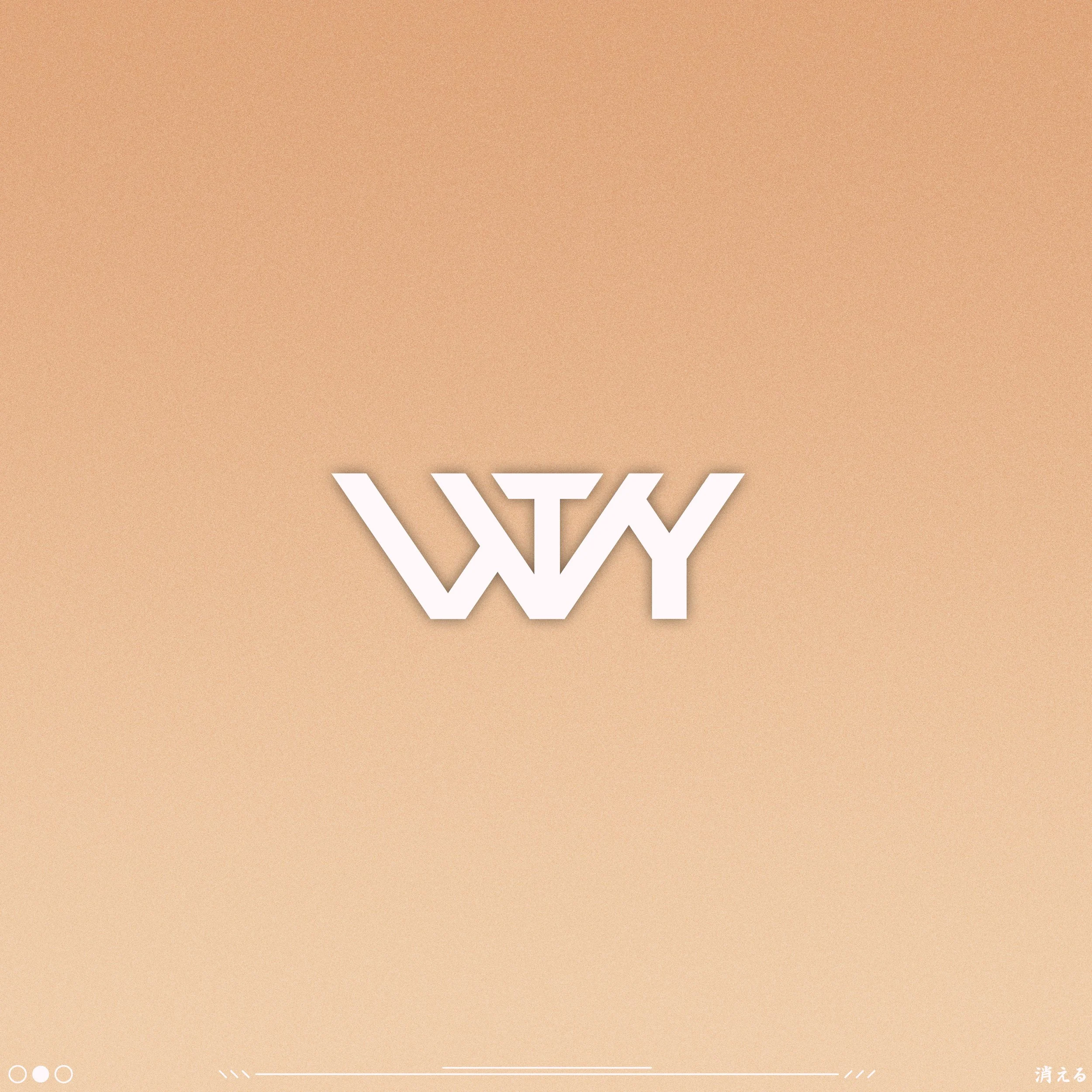
The goal of these designs were to represent a Makeup / Cosmetic company. Thin widths are chosen for text to promote elegance & simplicity. While a larger, thicker sub logo was designed for larger and more louder appearances on certain products such as Apparel, Lifestyle merchandise, and to stand out in smaller logo locations.
The larger logo shows the letters VTY, but also has a 2nd V combined to the letter T. At times flipping the letter A to a V can still be read as the letter “A” such as “BLVCK” and is done purely for aesthetics. That was the purpose of the 2nd V that is combined with the letter T.